Breadcrumbs navigation
Prague metro
The first stations on metro line A to be put into operation were special because they were built using the tunnel boring method, so the platform walls are not vertically straight. Therefore, the tunnel lining had to meet requirements to reduce noise and pressure when the train enters the station, but also allow for the attachment of the aluminium tiles, which were designed in the 1970s by Jaroslav Otruba.
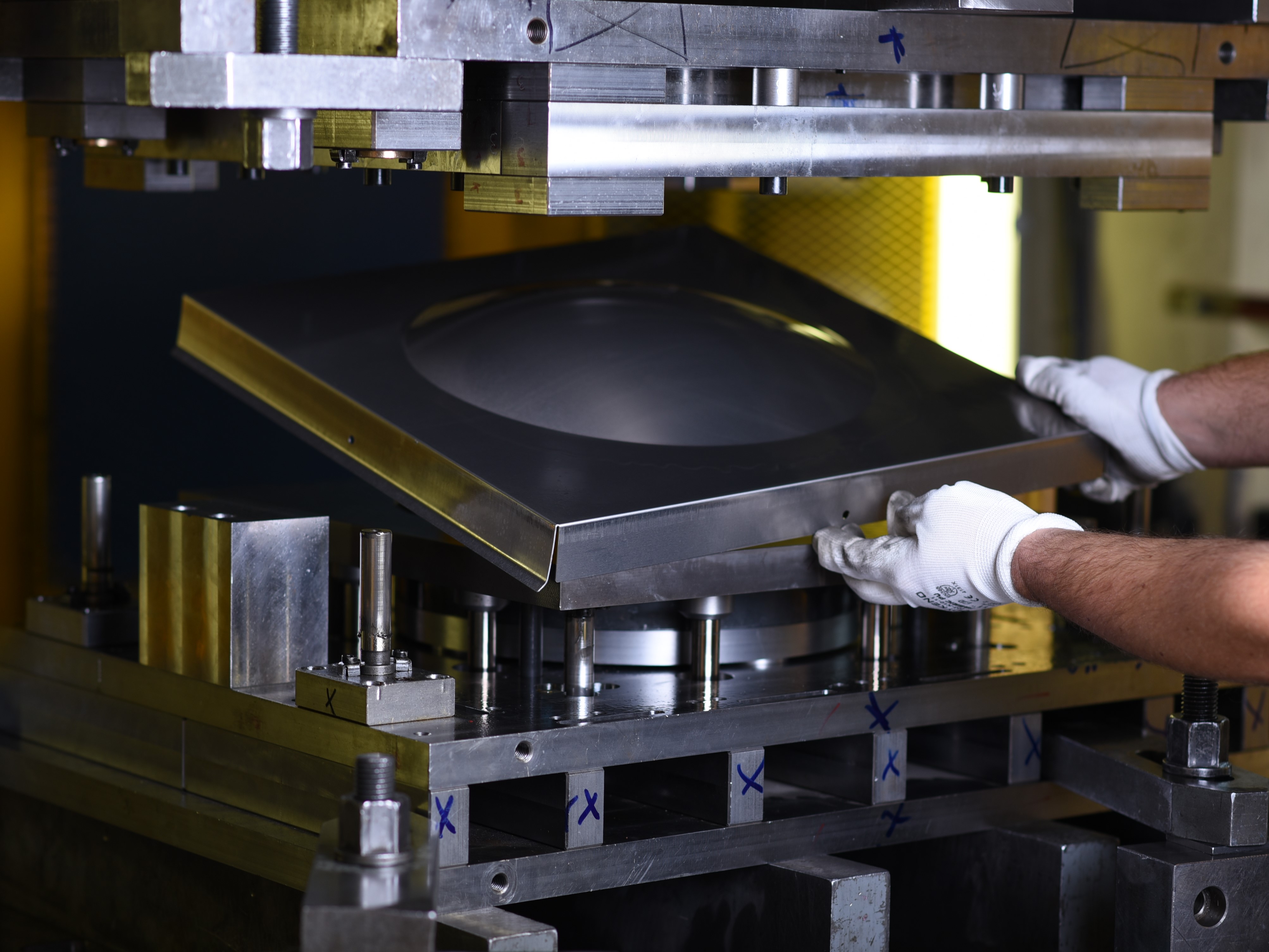
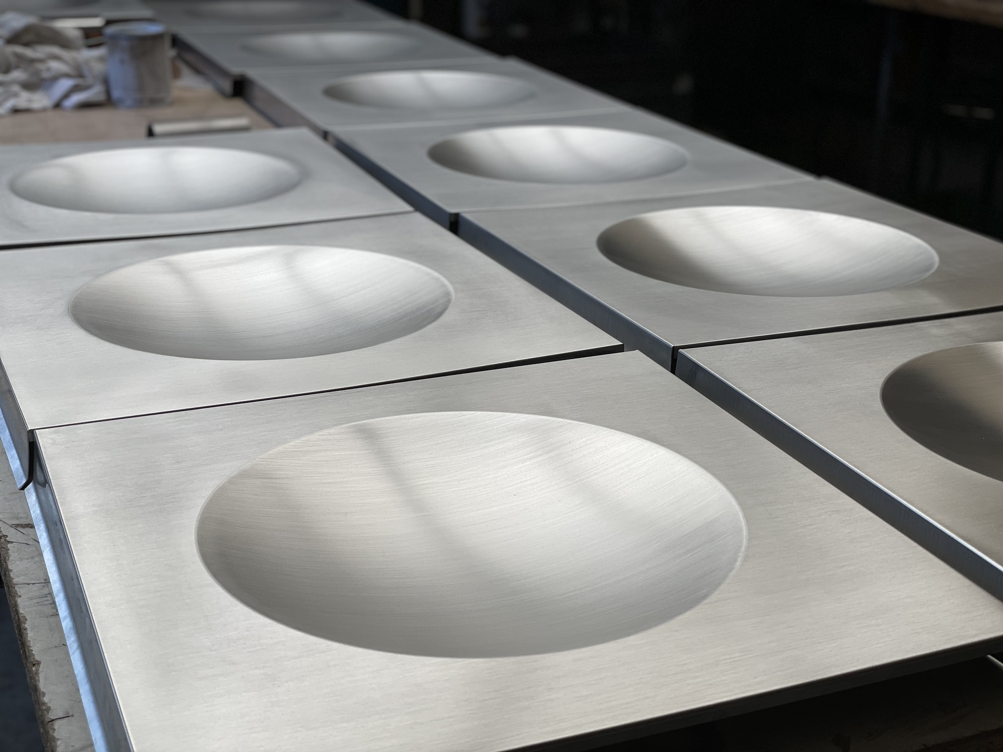
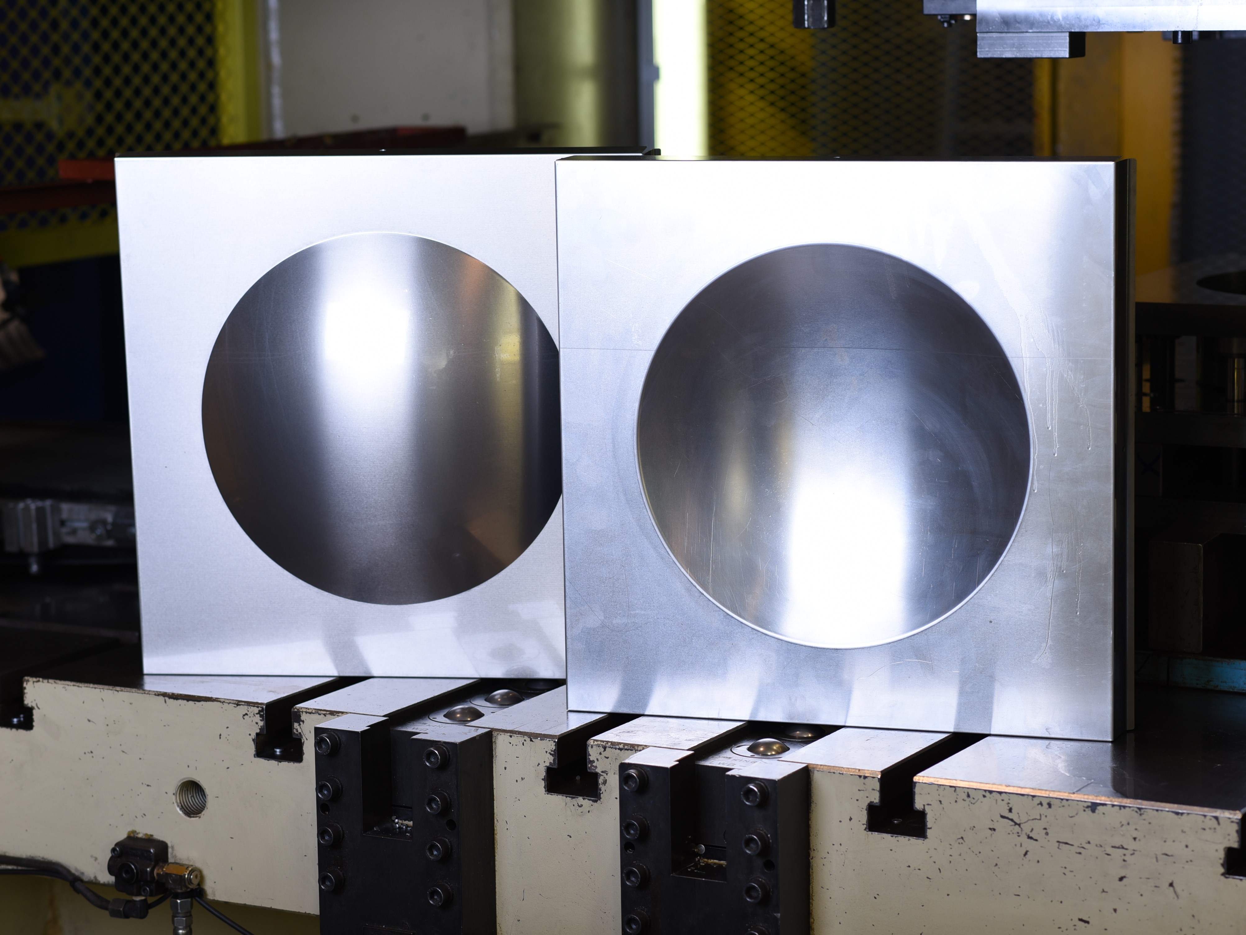
The tiles are made of a very pure aluminium alloy. The 1 mm thick aluminium sheets are pressed into moulds in the form of concave and convex shapes, also known as the “breast / anti-breast”. The aluminium used to manufacture these tiles was imported from Italy.
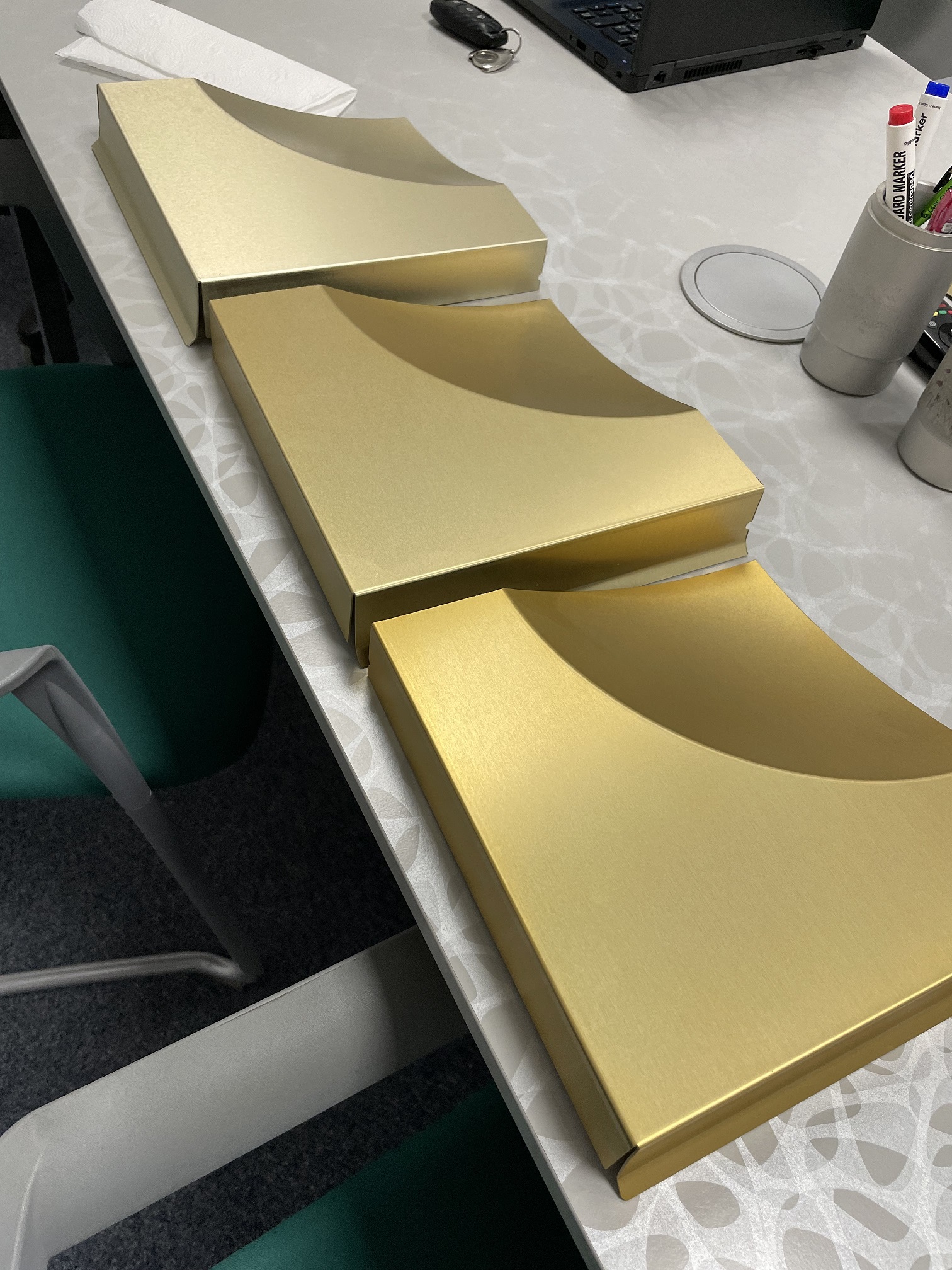
The tiles are manufactured using the anodising technology. This is a technique that is commonly used in aviation for the surface treatment / colouring of aluminium. The resulting brilliant colours, which are visible in Prague’s metro stations, were achieved using organic dyes. These are natural colourants are susceptible to external influences and require proper storage. The dye does not remain on the surface, but rather seeps into the material. Anodising always creates a range of hues from one basic colour, depending on how long it is left to act. It is an energy-consuming technique with high environmental impact. Due to the chosen dyeing process, each tile is unique. Anodising is usually used only on small parts and therefore components as large as the metro tiles are therefore absolutely unique. Another interesting fact is that the tiles do not corrode.
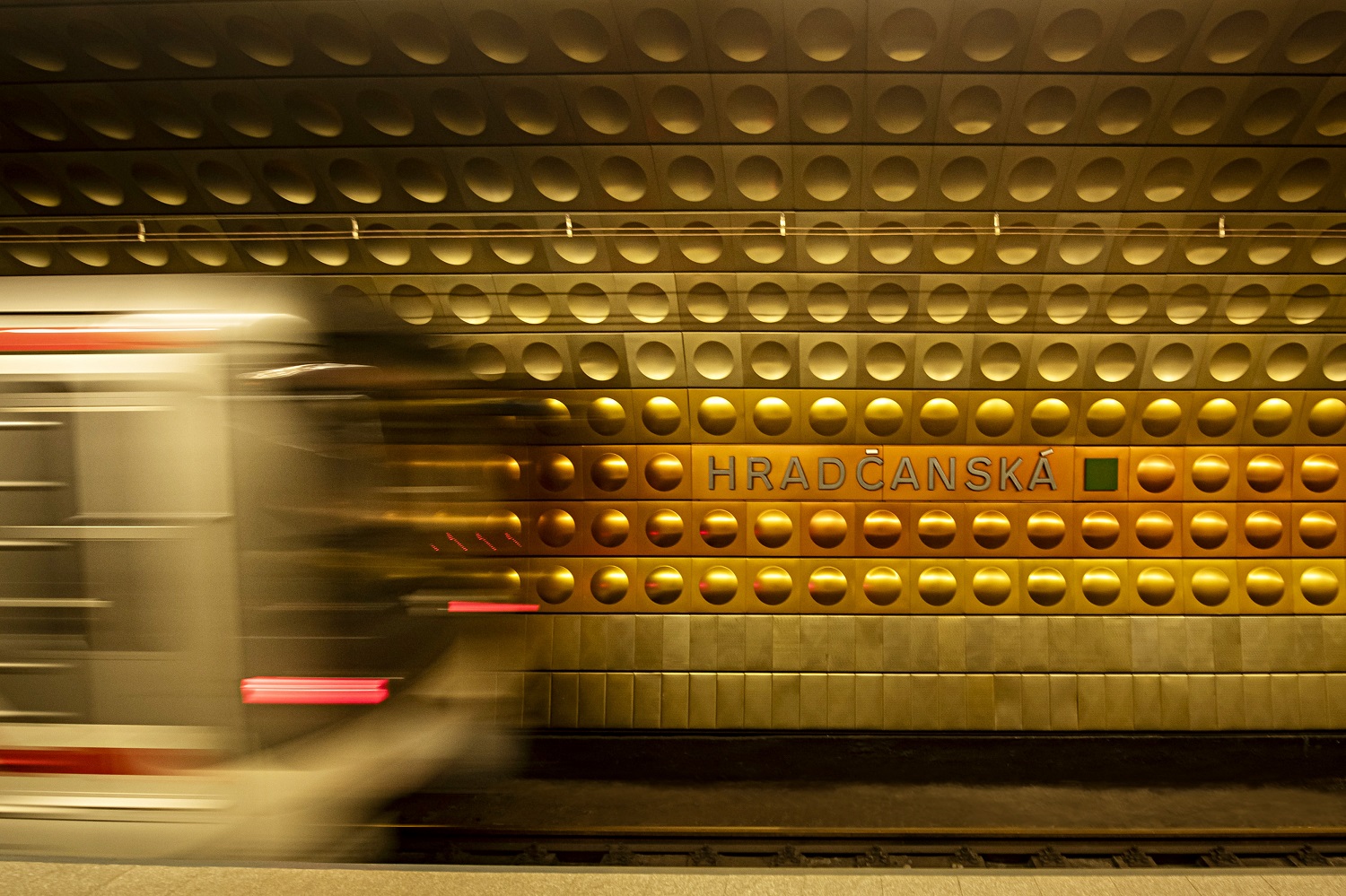
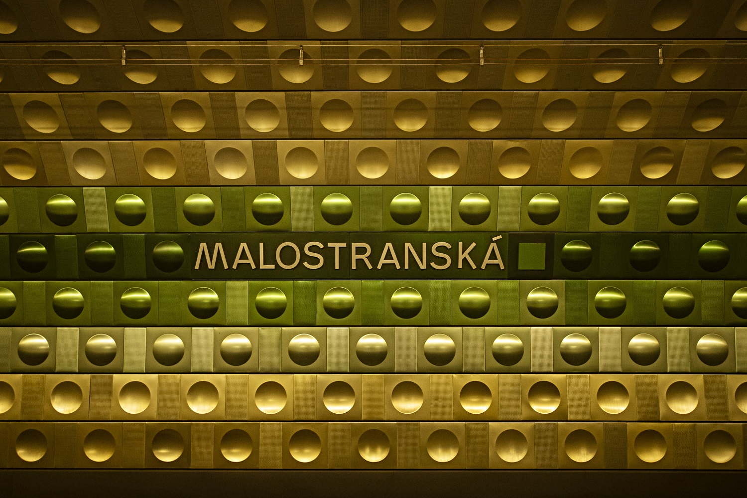
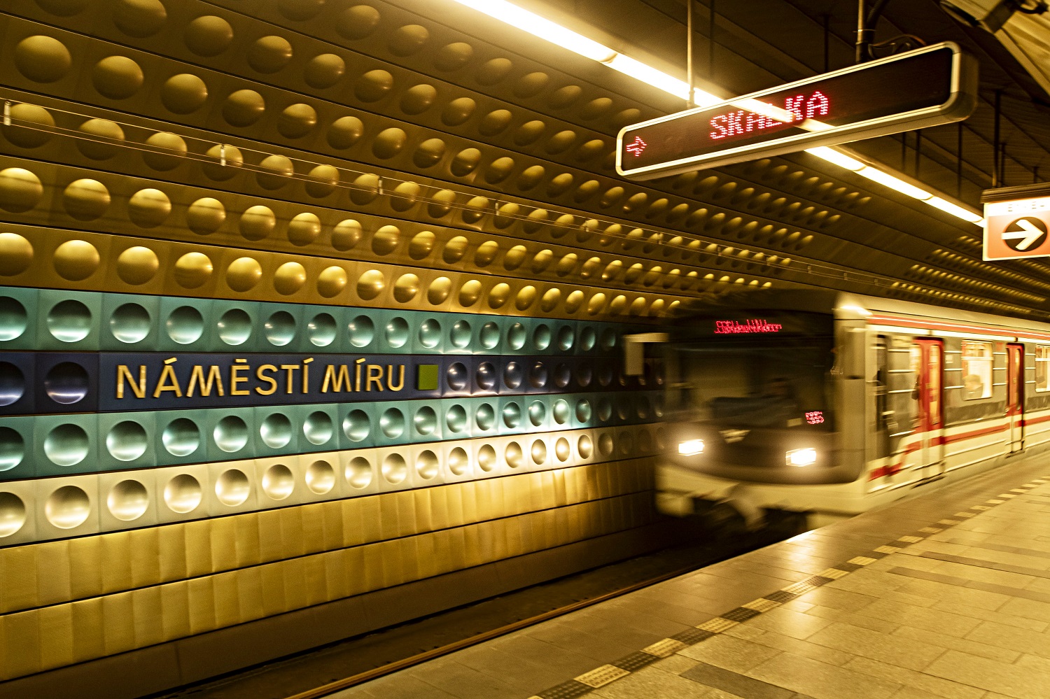
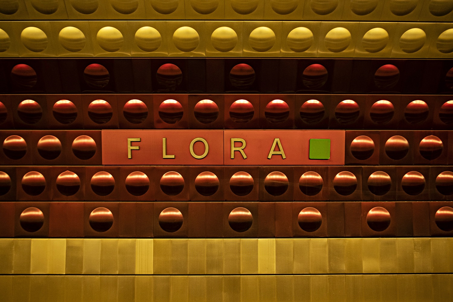
The dimensions of the anodised tiles are 48 x 48 cm. In each station, you can see thousands of individual units, indeed one of them is clad with 5,000 tiles. Their distinctive and hard to describe metallic sheen is stunning.
Colours of metro A stations:
The colour schemes of the stations are associated with Otruba’s paintings, and feature his own design and favourite colour combinations. They also carry essential orientational meaning. Why? The station tunnels all look the same, which is why Otruba opted for colour orientation. The only unifying element is the champagne-coloured line.
Flora – purple – referring to the grapes of historical vineyards
Jiřího z Poděbrad – teal / gold – symbolises the reign of Jiří of Poděbrady
Náměstí Míru – blue – the colour of peace
Muzeum – brown – symbolises the city fortification walls that once stood here
Můstek – champagne / golden-yellow – symbolises trade
Staroměstská – red – symbolises the communist coup in February 1948
Malostranská – green – recalls the Lesser Town gardens located nearby
Hradčanská – gold – symbolises the nearby Prague Castle – seat of the Bohemian kings